
An app that made store operations faster and helped the business scale
Period
April 2019 — May 2020
Company
Samokat, instant grocery delivery
Users
Pickers, couriers, and receiving clerks
Role
Product Designer
Summary
I helped transform fragmented, manual dark-store workflows into a mobile product designed for fast, high-frequency operations in real working conditions. Through close observation of core processes, I identified key operational bottlenecks and translated them into design decisions that reduced cognitive load, improved speed and accuracy, and increased efficiency at scale. This created a foundation that not only addressed the initial scaling challenges but enabled further optimization across the operation.
2×
fewer clerks for receiving
3×
faster operations
Context
The product started as an early pilot with a limited assortment and small-scale operations. After the hypothesis was validated, the company began scaling rapidly in Moscow in 2019, expanding its dark-store network and increasing order volume.
But dark-store operations still relied on fragmented tools, manual steps, and paper-based workflows that were poorly suited to high-frequency mobile tasks. As volume grew, these inefficiencies slowed execution, increased errors, and made scaling more expensive.
Goal
Our goal was to replace manual and desktop-bound workflows with a single mobile solution that could support fast execution in real operational conditions, reduce cognitive load, and improve efficiency at scale.
Discovery
Dark-store staff perform high-frequency operational tasks under time pressure in physically demanding environments. They work on the move, often with phones mounted on carts or worn on the arm, and need to quickly pick items, receive and count stock, navigate deliveries, and complete orders with minimal errors and cognitive load.
Ideally, the app would cover all mobility-dependent operations: picking, delivery, inbound and outbound receiving, inventory and write-offs, workforce management, equipment checks, and more. But first, we had to focus on the most critical workflows to speed up core tasks and reduce errors. As more operations became digitized, we would be able to capture loss-related analytics and identify further opportunities for optimization.
Research
To understand where to start, I visited several dark stores and conducted field observations of inbound receiving, order picking, delivery, and inventory and write-off procedures.
Field research inside working dark stores
Key insights
- For picking, the device running the app is mounted to a cart about 70–90 cm from the picker’s eyes (vs. 30–40 cm in normal phone use).
- In the desktop tool for inbound receiving, clerks work in pairs: one checks, counts, and scans items against a paper invoice while the other enters accepted quantities in the interface.
- Pickers struggle to find items on shelves when they only have a text description in the app.
- For delivery, couriers first load the orders into the backpack, then check the destination address, and upon arrival unload the orders and hand them to the customer.
Prioritization
After mapping operational processes and user experience, I outlined the core operations as storyboards with brief descriptions of user actions. Together with the wireframes, it became clear which operations were the most complex and required users to process large amounts of information.
Identifying complexity through storyboards and wireframes
To address pain points, I built CJMs for each role and highlighted improvement areas. Together with the team, we prioritized ideas by implementation effort and user/business value and built a hypothesis backlog to take into design.
Customer (user) journey map for order-picking
Concept
For the new app, I defined three core design principles: single-tasking, step-by-step flow, and modularity.
Single-tasking
To reduce cognitive load, each user flow is broken into small, sequential steps. By focusing on one task at a time, users process less extraneous information, decide faster, and make fewer mistakes.
Customer (user) journey map for order-picking
Example: the delivery flow is split into taking the order, building the route, traveling to the customer’s building, finding the apartment, and handing off the order. To proceed, the user performs specific actions with only the necessary information visible. For instance, to arrive on time, the courier needs remaining delivery time plus the street name and building number.
Step-by-step flow
Operations are split into steps with forward navigation through consecutive screens of a single flow. Button labels indicate what comes next. Low-frequency actions are moved into secondary flows reachable from the main screen.
Primary flow & secondary actions
Modularity
We expected the number of digitized dark-store operations to grow over time, so the app had to cover more and more workflows. To scale quickly, I prepared a system of standard modules that can be composed into screens for digitizing dark-store processes. Using these modules, we designed operations like inventory counting and write-offs, return-to-stock, parcel delivery, and more.
Building blocks from the module system
First version
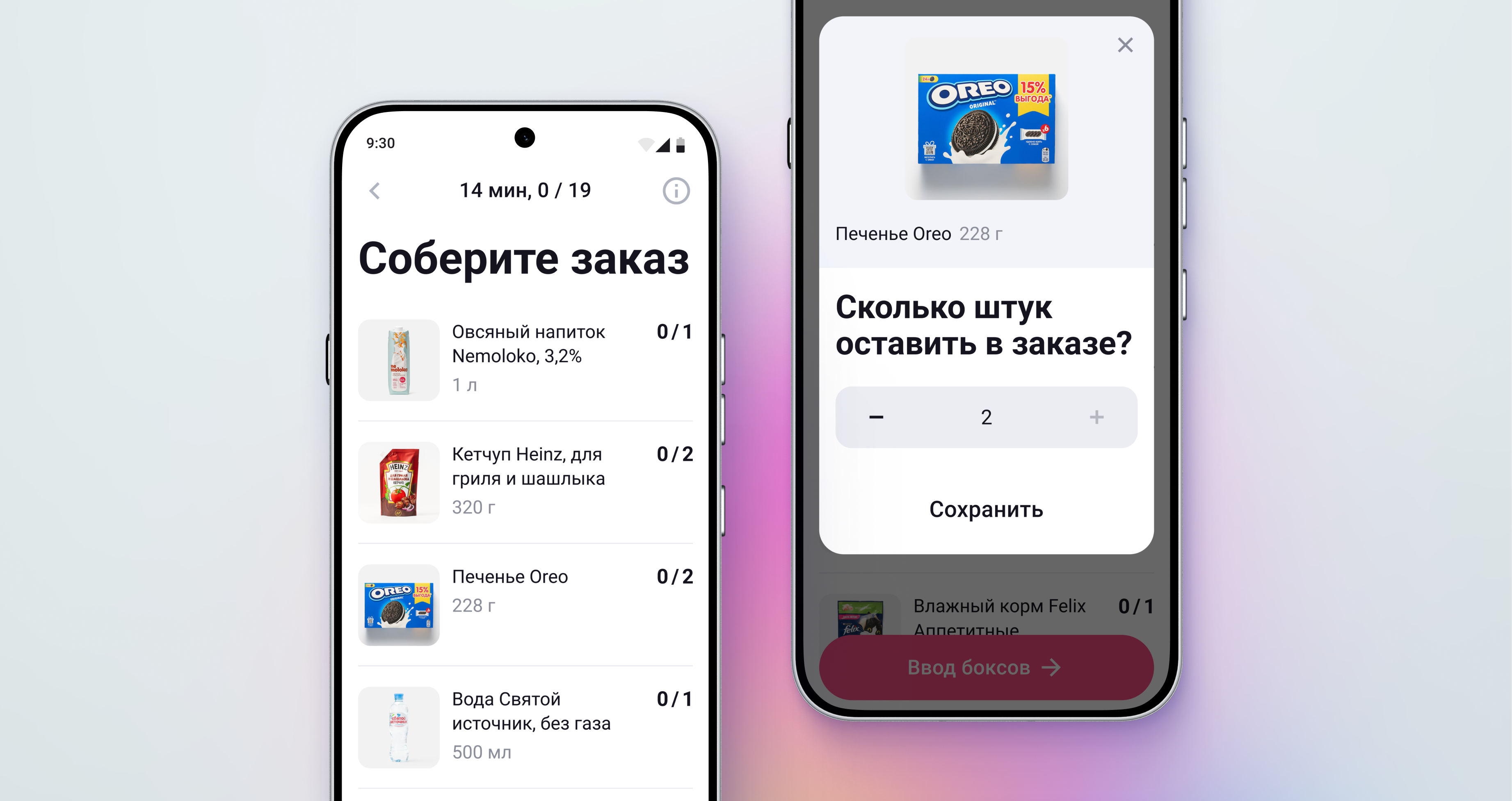
The first release digitized core dark-store operations and addressed the most critical UX pain points.
Finding items on shelves
Problem: Pickers struggled to locate items using only text descriptions.
Hypothesis: Showing item photos alongside descriptions would let pickers identify items faster.
Result: Pickers reported assembling by photos and using text mainly to distinguish similar items. They rarely opened full-size images; the list thumbnails were enough.
Solutions: 1) Large photos in the list. 2) Enlarge photo on long press.
Visual element legibility
Problem: Pickers have trouble seeing UI elements because the device with the app is mounted on a cart about 1 meter from their eyes.
Hypothesis: Increasing the size of text and UI elements will make on-screen information easier to read and reduce errors.
Result: Pickers cared less about text size once photos were added, but noted that large numbers help avoid mistakes when entering box IDs.
Solutions: 1) Larger type for headings and body text. 2) Large buttons, photos, and icons.
Cost of inbound receiving
Problem: In the current desktop tool, inbound receiving is done in pairs: one person counts and scans items, while the other enters the accepted quantities in the interface. Coordinating actions and passing information verbally makes receiving slow and costly.
Hypothesis: In the mobile app, a receiving clerk could work solo with an arm-mounted phone—checking items and entering data directly.
Result: Moving receiving to mobile halved the number of clerks needed for the task and cut receiving time by more than three times thanks to a simpler process and more convenient UX.
Solution: Mobile app for inbound receiving
Delivery screen information
Problem: Couriers need lots of information to complete deliveries and have to scroll through a long order screen.
Hypothesis: Breaking order information into step-by-step screens aligned with delivery stages—and using larger UI elements—will surface the right details at the right moment, reducing delivery time and order errors.
Result: Couriers praised larger UI elements—they no longer needed to bring the phone closer. However, separating the address and box list into different steps proved inconvenient: in the elevator, they want the apartment info and box numbers together. Users also interpreted primary button text as an action, not as the next step’s title.
Solutions: 1) Split delivery information into step-by-step screens. 2) Large buttons, photos, and icons.
Refinements in later versions
After launching the MVP, we iterated actively based on user feedback. They contacted support with these complaints:
- Large edge-to-edge buttons caused mis-taps when using gesture navigation.
- A bright screen blinded couriers at night; most deliveries happen in the evening when customers return from work.
- Orders were being completed prematurely because phones unlocked in couriers’ pockets and the confirmation was triggered accidentally.
Live product in daily operations
Mis-taps with gesture navigation
Problem: Edge-to-edge primary buttons led to accidental taps with system gestures.
Hypothesis: Adding padding between the primary button and screen edges would reduce mis-taps.
Result: The issue of accidental taps with gesture navigation was resolved, and users no longer reported it.
Solutions: 1) Add padding between the primary button and screen edges. 2) Reduce the primary button size.
Low night-time visibility
Problem: The app’s bright screen dazzles couriers in the evening on the road. Most deliveries happen in the evening, when customers are coming home from work.
Hypothesis: Implementing a dark mode would reduce glare and make deliveries safer. It would also save battery life, allowing couriers to complete more deliveries without recharging.
Result: Couriers welcomed dark mode, and the app’s Google Play rating increased.
Solutions: 1) Dark theme for the app. 2) Theme-switching settings.
Accidental delivery completion
Problem: Orders were being closed mid-delivery due to mis-taps.
Hypothesis: Replacing modal confirmation with a swipe-to-complete control would reduce accidental closures.
Result: Replacing the confirmation modal with a swipe-to-complete control reduced accidental delivery completions. We did receive some complaints from users with cracked screens who found swiping difficult, but the volume was negligible compared to the overall audience.
Solutions: 1) Remove the confirmation modal. 2) Complete delivery via a slider button.
Outcome
Early in a period of rapid growth, our mobile app helped the business digitize and manage high-frequency operations—accelerating workflows and lowering costs. Over the next couple of years, it became the foundation for a suite of standalone products and teams—covering courier experience, the picking process, inbound flow, and in-store operations—and the principles and UX patterns established from day one enabled fast, consistent scaling.
Building on the app, we later launched features such as automatic order consolidation, shared delivery, meal prep, address-based parcel storage, click-and-collect handoff, clickless picking, and many other operational experiments and improvements.
Explore more projects
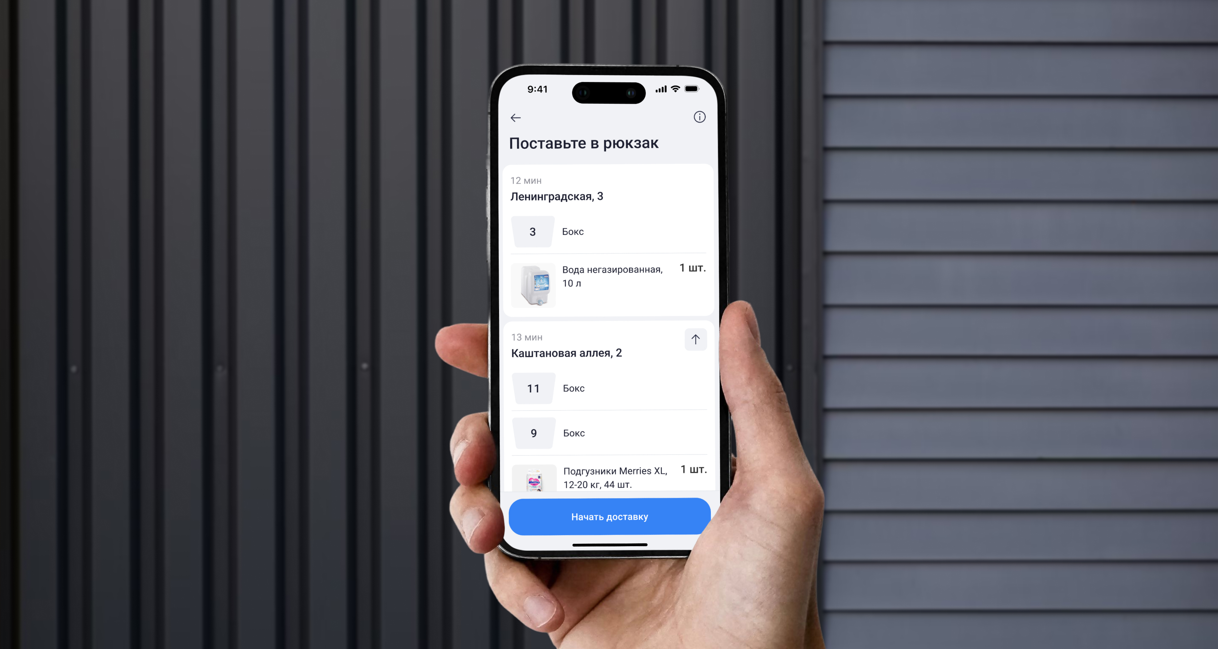
A React Native migration that expanded the hiring funnel by 32%
New app for iOS for Samokat dark-stores
Read case study
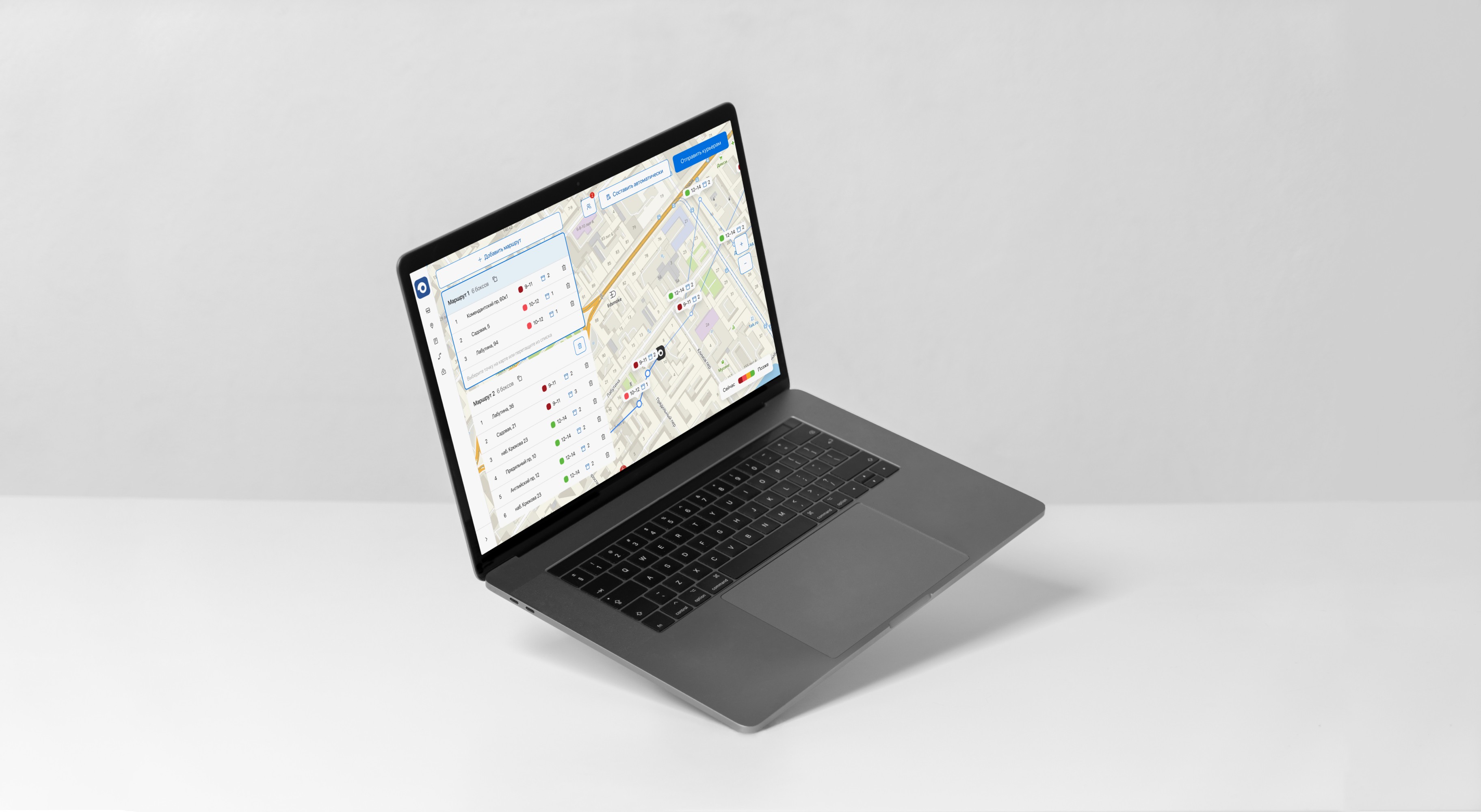
A web route-planning interface that cut planning time by 40x
Route planning web tool for Samokat
Read case study
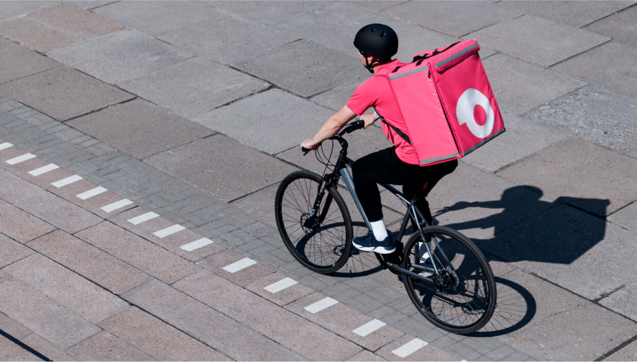
Bonus: A new form factor for delivery bags that tripled order capacity
Delivery bags for Samokat couriers
Read case study
An app that made store operations faster and helped the business scale
Period
April 2019 — May 2020
Company
Samokat, instant grocery delivery
Users
Pickers, couriers, and receiving clerks
Role
Product Designer
Summary
I helped transform fragmented, manual dark-store workflows into a mobile product designed for fast, high-frequency operations in real working conditions. Through close observation of core processes, I identified key operational bottlenecks and translated them into design decisions that reduced cognitive load, improved speed and accuracy, and increased efficiency at scale. This created a foundation that not only addressed the initial scaling challenges but enabled further optimization across the operation.
2×
fewer clerks for receiving
3×
faster operations
Context
The product started as an early pilot with a limited assortment and small-scale operations. After the hypothesis was validated, the company began scaling rapidly in Moscow in 2019, expanding its dark-store network and increasing order volume.
But dark-store operations still relied on fragmented tools, manual steps, and paper-based workflows that were poorly suited to high-frequency mobile tasks. As volume grew, these inefficiencies slowed execution, increased errors, and made scaling more expensive.
Goal
Our goal was to replace manual and desktop-bound workflows with a single mobile solution that could support fast execution in real operational conditions, reduce cognitive load, and improve efficiency at scale.
Discovery
Dark-store staff perform high-frequency operational tasks under time pressure in physically demanding environments. They work on the move, often with phones mounted on carts or worn on the arm, and need to quickly pick items, receive and count stock, navigate deliveries, and complete orders with minimal errors and cognitive load.
Ideally, the app would cover all mobility-dependent operations: picking, delivery, inbound and outbound receiving, inventory and write-offs, workforce management, equipment checks, and more. But first, we had to focus on the most critical workflows to speed up core tasks and reduce errors. As more operations became digitized, we would be able to capture loss-related analytics and identify further opportunities for optimization.
Research
To understand where to start, I visited several dark stores and conducted field observations of inbound receiving, order picking, delivery, and inventory and write-off procedures.
Field research inside working dark stores
Key insights
- For picking, the device running the app is mounted to a cart about 70–90 cm from the picker’s eyes (vs. 30–40 cm in normal phone use).
- In the desktop tool for inbound receiving, clerks work in pairs: one checks, counts, and scans items against a paper invoice while the other enters accepted quantities in the interface.
- Pickers struggle to find items on shelves when they only have a text description in the app.
- For delivery, couriers first load the orders into the backpack, then check the destination address, and upon arrival unload the orders and hand them to the customer.
Prioritization
After mapping operational processes and user experience, I outlined the core operations as storyboards with brief descriptions of user actions. Together with the wireframes, it became clear which operations were the most complex and required users to process large amounts of information.
Identifying complexity through storyboards and wireframes
To address pain points, I built CJMs for each role and highlighted improvement areas. Together with the team, we prioritized ideas by implementation effort and user/business value and built a hypothesis backlog to take into design.
Customer (user) journey map for order-picking
Concept
For the new app, I defined three core design principles: single-tasking, step-by-step flow, and modularity.
Single-tasking
To reduce cognitive load, each user flow is broken into small, sequential steps. By focusing on one task at a time, users process less extraneous information, decide faster, and make fewer mistakes.
Customer (user) journey map for order-picking
Example: the delivery flow is split into taking the order, building the route, traveling to the customer’s building, finding the apartment, and handing off the order. To proceed, the user performs specific actions with only the necessary information visible. For instance, to arrive on time, the courier needs remaining delivery time plus the street name and building number.
Step-by-step flow
Operations are split into steps with forward navigation through consecutive screens of a single flow. Button labels indicate what comes next. Low-frequency actions are moved into secondary flows reachable from the main screen.
Primary flow & secondary actions
Modularity
We expected the number of digitized dark-store operations to grow over time, so the app had to cover more and more workflows. To scale quickly, I prepared a system of standard modules that can be composed into screens for digitizing dark-store processes. Using these modules, we designed operations like inventory counting and write-offs, return-to-stock, parcel delivery, and more.
Building blocks from the module system
First version
The first release digitized core dark-store operations and addressed the most critical UX pain points.
Finding items on shelves
Problem: Pickers struggled to locate items using only text descriptions.
Hypothesis: Showing item photos alongside descriptions would let pickers identify items faster.
Result: Pickers reported assembling by photos and using text mainly to distinguish similar items. They rarely opened full-size images; the list thumbnails were enough.
Solutions: 1) Large photos in the list. 2) Enlarge photo on long press.
Visual element legibility
Problem: Pickers have trouble seeing UI elements because the device with the app is mounted on a cart about 1 meter from their eyes.
Hypothesis: Increasing the size of text and UI elements will make on-screen information easier to read and reduce errors.
Result: Pickers cared less about text size once photos were added, but noted that large numbers help avoid mistakes when entering box IDs.
Solutions: 1) Larger type for headings and body text. 2) Large buttons, photos, and icons.
Cost of inbound receiving
Problem: In the current desktop tool, inbound receiving is done in pairs: one person counts and scans items, while the other enters the accepted quantities in the interface. Coordinating actions and passing information verbally makes receiving slow and costly.
Hypothesis: In the mobile app, a receiving clerk could work solo with an arm-mounted phone—checking items and entering data directly.
Result: Moving receiving to mobile halved the number of clerks needed for the task and cut receiving time by more than three times thanks to a simpler process and more convenient UX.
Solution: Mobile app for inbound receiving
Delivery screen information
Problem: Couriers need lots of information to complete deliveries and have to scroll through a long order screen.
Hypothesis: Breaking order information into step-by-step screens aligned with delivery stages—and using larger UI elements—will surface the right details at the right moment, reducing delivery time and order errors.
Result: Couriers praised larger UI elements—they no longer needed to bring the phone closer. However, separating the address and box list into different steps proved inconvenient: in the elevator, they want the apartment info and box numbers together. Users also interpreted primary button text as an action, not as the next step’s title.
Solutions: 1) Split delivery information into step-by-step screens. 2) Large buttons, photos, and icons.
Refinements in later versions
After launching the MVP, we iterated actively based on user feedback. They contacted support with these complaints:
- Large edge-to-edge buttons caused mis-taps when using gesture navigation.
- A bright screen blinded couriers at night; most deliveries happen in the evening when customers return from work.
- Orders were being completed prematurely because phones unlocked in couriers’ pockets and the confirmation was triggered accidentally.
Live product in daily operations
Mis-taps with gesture navigation
Problem: Edge-to-edge primary buttons led to accidental taps with system gestures.
Hypothesis: Adding padding between the primary button and screen edges would reduce mis-taps.
Result: The issue of accidental taps with gesture navigation was resolved, and users no longer reported it.
Solutions: 1) Add padding between the primary button and screen edges. 2) Reduce the primary button size.
Low night-time visibility
Problem: The app’s bright screen dazzles couriers in the evening on the road. Most deliveries happen in the evening, when customers are coming home from work.
Hypothesis: Implementing a dark mode would reduce glare and make deliveries safer. It would also save battery life, allowing couriers to complete more deliveries without recharging.
Result: Couriers welcomed dark mode, and the app’s Google Play rating increased.
Solutions: 1) Dark theme for the app. 2) Theme-switching settings.
Accidental delivery completion
Problem: Orders were being closed mid-delivery due to mis-taps.
Hypothesis: Replacing modal confirmation with a swipe-to-complete control would reduce accidental closures.
Result: Replacing the confirmation modal with a swipe-to-complete control reduced accidental delivery completions. We did receive some complaints from users with cracked screens who found swiping difficult, but the volume was negligible compared to the overall audience.
Solutions: 1) Remove the confirmation modal. 2) Complete delivery via a slider button.
Outcome
Early in a period of rapid growth, our mobile app helped the business digitize and manage high-frequency operations—accelerating workflows and lowering costs. Over the next couple of years, it became the foundation for a suite of standalone products and teams—covering courier experience, the picking process, inbound flow, and in-store operations—and the principles and UX patterns established from day one enabled fast, consistent scaling.
Building on the app, we later launched features such as automatic order consolidation, shared delivery, meal prep, address-based parcel storage, click-and-collect handoff, clickless picking, and many other operational experiments and improvements.
Explore more projects
A React Native migration that expanded the hiring funnel by 32%
New app for iOS for Samokat dark-stores
Read case study
A web route-planning interface that cut planning time by 40x
Route planning web tool for Samokat
Read case study
Bonus: A new form factor for delivery bags that tripled order capacity
Delivery bags for Samokat couriers
Read case study
An app that made store operations faster and helped the business scale
Period
April 2019 — May 2020
Company
Samokat, instant grocery delivery
Users
Pickers, couriers, and receiving clerks
Role
Product Designer
Summary
I helped transform fragmented, manual dark-store workflows into a mobile product designed for fast, high-frequency operations in real working conditions. Through close observation of core processes, I identified key operational bottlenecks and translated them into design decisions that reduced cognitive load, improved speed and accuracy, and increased efficiency at scale. This created a foundation that not only addressed the initial scaling challenges but enabled further optimization across the operation.
2×
fewer clerks for receiving
3×
faster operations
Context
The product started as an early pilot with a limited assortment and small-scale operations. After the hypothesis was validated, the company began scaling rapidly in Moscow in 2019, expanding its dark-store network and increasing order volume.
But dark-store operations still relied on fragmented tools, manual steps, and paper-based workflows that were poorly suited to high-frequency mobile tasks. As volume grew, these inefficiencies slowed execution, increased errors, and made scaling more expensive.
Goal
Our goal was to replace manual and desktop-bound workflows with a single mobile solution that could support fast execution in real operational conditions, reduce cognitive load, and improve efficiency at scale.
Discovery
Dark-store staff perform high-frequency operational tasks under time pressure in physically demanding environments. They work on the move, often with phones mounted on carts or worn on the arm, and need to quickly pick items, receive and count stock, navigate deliveries, and complete orders with minimal errors and cognitive load.
Ideally, the app would cover all mobility-dependent operations: picking, delivery, inbound and outbound receiving, inventory and write-offs, workforce management, equipment checks, and more. But first, we had to focus on the most critical workflows to speed up core tasks and reduce errors. As more operations became digitized, we would be able to capture loss-related analytics and identify further opportunities for optimization.
Research
To understand where to start, I visited several dark stores and conducted field observations of inbound receiving, order picking, delivery, and inventory and write-off procedures.
Field research inside working dark stores
Key insights
- For picking, the device running the app is mounted to a cart about 70–90 cm from the picker’s eyes (vs. 30–40 cm in normal phone use).
- In the desktop tool for inbound receiving, clerks work in pairs: one checks, counts, and scans items against a paper invoice while the other enters accepted quantities in the interface.
- Pickers struggle to find items on shelves when they only have a text description in the app.
- For delivery, couriers first load the orders into the backpack, then check the destination address, and upon arrival unload the orders and hand them to the customer.
Prioritization
After mapping operational processes and user experience, I outlined the core operations as storyboards with brief descriptions of user actions. Together with the wireframes, it became clear which operations were the most complex and required users to process large amounts of information.
Identifying complexity through storyboards and wireframes
To address pain points, I built CJMs for each role and highlighted improvement areas. Together with the team, we prioritized ideas by implementation effort and user/business value and built a hypothesis backlog to take into design.
Customer (user) journey map for order-picking
Concept
For the new app, I defined three core design principles: single-tasking, step-by-step flow, and modularity.
Single-tasking
To reduce cognitive load, each user flow is broken into small, sequential steps. By focusing on one task at a time, users process less extraneous information, decide faster, and make fewer mistakes.
Customer (user) journey map for order-picking
Example: the delivery flow is split into taking the order, building the route, traveling to the customer’s building, finding the apartment, and handing off the order. To proceed, the user performs specific actions with only the necessary information visible. For instance, to arrive on time, the courier needs remaining delivery time plus the street name and building number.
Step-by-step flow
Operations are split into steps with forward navigation through consecutive screens of a single flow. Button labels indicate what comes next. Low-frequency actions are moved into secondary flows reachable from the main screen.
Primary flow & secondary actions
Modularity
We expected the number of digitized dark-store operations to grow over time, so the app had to cover more and more workflows. To scale quickly, I prepared a system of standard modules that can be composed into screens for digitizing dark-store processes. Using these modules, we designed operations like inventory counting and write-offs, return-to-stock, parcel delivery, and more.
Building blocks from the module system
First version
The first release digitized core dark-store operations and addressed the most critical UX pain points.
Finding items on shelves
Problem: Pickers struggled to locate items using only text descriptions.
Hypothesis: Showing item photos alongside descriptions would let pickers identify items faster.
Result: Pickers reported assembling by photos and using text mainly to distinguish similar items. They rarely opened full-size images; the list thumbnails were enough.
Solutions: 1) Large photos in the list. 2) Enlarge photo on long press.
Visual element legibility
Problem: Pickers have trouble seeing UI elements because the device with the app is mounted on a cart about 1 meter from their eyes.
Hypothesis: Increasing the size of text and UI elements will make on-screen information easier to read and reduce errors.
Result: Pickers cared less about text size once photos were added, but noted that large numbers help avoid mistakes when entering box IDs.
Solutions: 1) Larger type for headings and body text. 2) Large buttons, photos, and icons.
Cost of inbound receiving
Problem: In the current desktop tool, inbound receiving is done in pairs: one person counts and scans items, while the other enters the accepted quantities in the interface. Coordinating actions and passing information verbally makes receiving slow and costly.
Hypothesis: In the mobile app, a receiving clerk could work solo with an arm-mounted phone—checking items and entering data directly.
Result: Moving receiving to mobile halved the number of clerks needed for the task and cut receiving time by more than three times thanks to a simpler process and more convenient UX.
Solution: Mobile app for inbound receiving
Delivery screen information
Problem: Couriers need lots of information to complete deliveries and have to scroll through a long order screen.
Hypothesis: Breaking order information into step-by-step screens aligned with delivery stages—and using larger UI elements—will surface the right details at the right moment, reducing delivery time and order errors.
Result: Couriers praised larger UI elements—they no longer needed to bring the phone closer. However, separating the address and box list into different steps proved inconvenient: in the elevator, they want the apartment info and box numbers together. Users also interpreted primary button text as an action, not as the next step’s title.
Solutions: 1) Split delivery information into step-by-step screens. 2) Large buttons, photos, and icons.
Refinements in later versions
After launching the MVP, we iterated actively based on user feedback. They contacted support with these complaints:
- Large edge-to-edge buttons caused mis-taps when using gesture navigation.
- A bright screen blinded couriers at night; most deliveries happen in the evening when customers return from work.
- Orders were being completed prematurely because phones unlocked in couriers’ pockets and the confirmation was triggered accidentally.
Live product in daily operations
Mis-taps with gesture navigation
Problem: Edge-to-edge primary buttons led to accidental taps with system gestures.
Hypothesis: Adding padding between the primary button and screen edges would reduce mis-taps.
Result: The issue of accidental taps with gesture navigation was resolved, and users no longer reported it.
Solutions: 1) Add padding between the primary button and screen edges. 2) Reduce the primary button size.
Low night-time visibility
Problem: The app’s bright screen dazzles couriers in the evening on the road. Most deliveries happen in the evening, when customers are coming home from work.
Hypothesis: Implementing a dark mode would reduce glare and make deliveries safer. It would also save battery life, allowing couriers to complete more deliveries without recharging.
Result: Couriers welcomed dark mode, and the app’s Google Play rating increased.
Solutions: 1) Dark theme for the app. 2) Theme-switching settings.
Accidental delivery completion
Problem: Orders were being closed mid-delivery due to mis-taps.
Hypothesis: Replacing modal confirmation with a swipe-to-complete control would reduce accidental closures.
Result: Replacing the confirmation modal with a swipe-to-complete control reduced accidental delivery completions. We did receive some complaints from users with cracked screens who found swiping difficult, but the volume was negligible compared to the overall audience.
Solutions: 1) Remove the confirmation modal. 2) Complete delivery via a slider button.
Outcome
Early in a period of rapid growth, our mobile app helped the business digitize and manage high-frequency operations—accelerating workflows and lowering costs. Over the next couple of years, it became the foundation for a suite of standalone products and teams—covering courier experience, the picking process, inbound flow, and in-store operations—and the principles and UX patterns established from day one enabled fast, consistent scaling.
Building on the app, we later launched features such as automatic order consolidation, shared delivery, meal prep, address-based parcel storage, click-and-collect handoff, clickless picking, and many other operational experiments and improvements.
Explore more projects
A React Native migration that expanded the hiring funnel by 32%
New app for iOS for Samokat dark-stores
Read case study
A web route-planning interface that cut planning time by 40x
Route planning web tool for Samokat
Read case study
Bonus: A new form factor for delivery bags that tripled order capacity
Delivery bags for Samokat couriers
Read case study