
A React Native migration that expanded the hiring funnel by 32%
Period
December 2022 — June 2023
Company
Samokat, instant grocery delivery
Users
Store staff and partners
Role
Product Design Lead
Summary
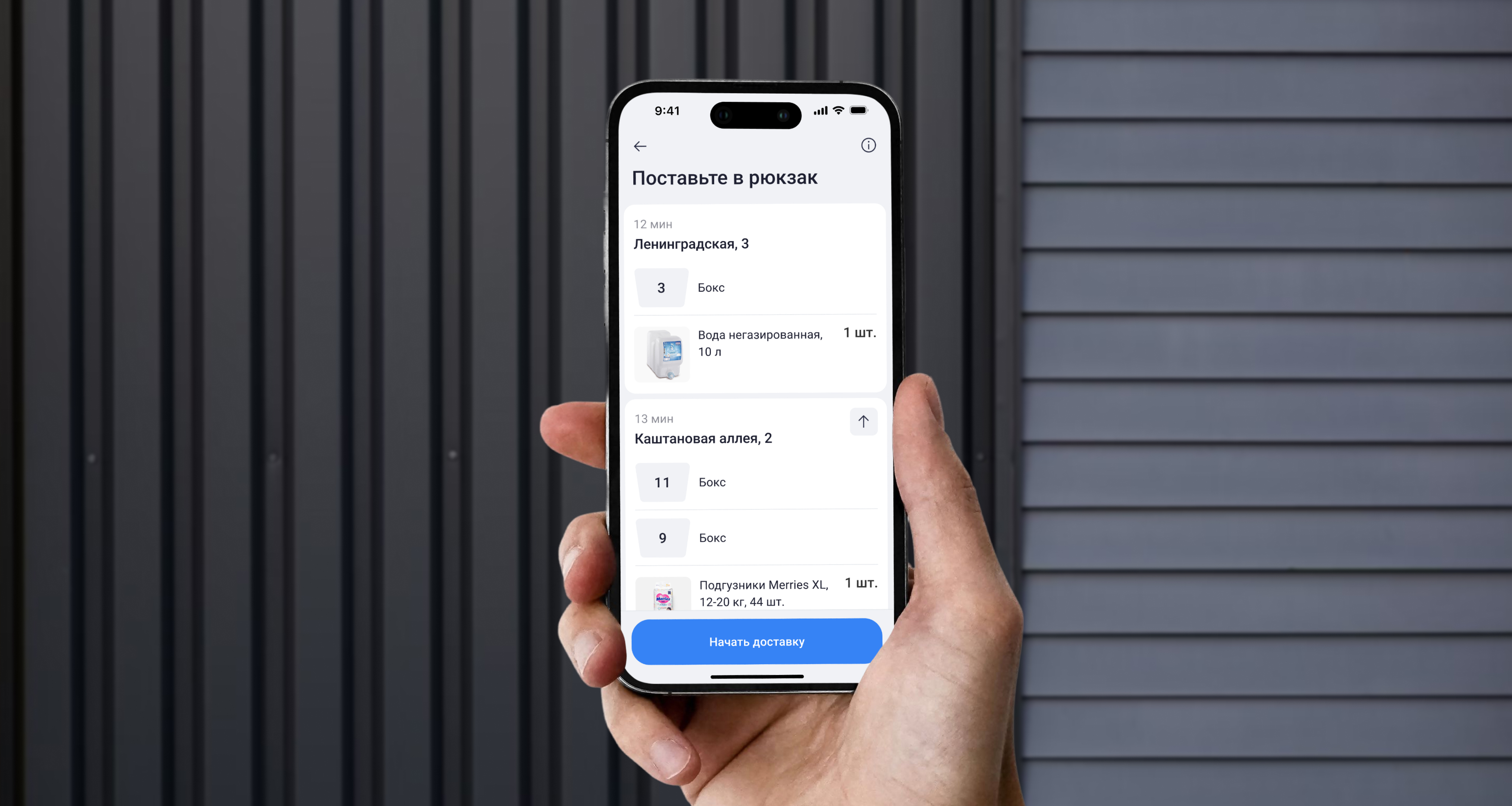
I made the app available on iOS by redesigning it with the new React Native mobile design system, expanding the hiring funnel by about 32%. As one of the first products built on the system, it also helped validate real use cases, refine components and patterns, and prepare the design system for scaling across other products. This groundwork later contributed to broader efficiency gains, reducing development effort by 20%.
32%
increase in the hiring funnel for store staff
20%
reduction in development effort
Context
The app for operational tasks was initially available only on Android, which considerably limited the hiring funnel. As the business expanded and iOS support became a priority, we decided to replace the legacy app with a new React Native version built on the new design system, making it available on both platforms while reducing long-term maintenance costs.
Goal
Adapt the full functionality of the existing app for warehouse operations and delivery to iOS devices using the new React Native design system.
Process
I split the migration into several stages:
- Auditing all existing functionality covering multiple dark-store roles
- Identifying improvement opportunities stemming from accumulated design debt
- Breaking the project into smaller tasks and planning design work within resource constraints
- Designing screens, running reviews with BAs and designers, then with engineering
- Usability testing with target users
We started with delivery flow: (1) couriers are the largest user group, (2) they use personal phones (often iPhones), and (3) delivery flows are simpler and faster to ship than other operations.
New Style & Palette
Historically, the mobile design system had a different visual style from our app. We chose not to retheme the design system to the familiar coral, to avoid complicating token management and to test the hypothesis that the pink accent color provides additional value for couriers beyond mere habit.
We couldn’t ship dark mode in the first version because the app’s palette is controlled by design-system tokens—and the design system team had this effort deprioritized. This was the perfect chance to refresh our understanding of dark mode demand across roles (spoiler: yes—couriers need it more).
Visual style update
Simplifying Navigation
We regularly collect user feedback and add to the UX debt backlog. Many small UX issues had lingered for years because legacy code made them expensive to address. A redesign was a great chance to fix these without changing core flows or product logic.
Text buttons
Minimal icon-only buttons were ambiguous in places, increasing learnability time and feature discoverability issues. I replaced unclear icon buttons with text buttons.
Clear text buttons replaced ambiguous icons
Minor actions in bottom sheets
To preserve context during secondary actions within a main flow, I replaced some full-screen modals with bottom sheets—simplifying the flow and reducing cognitive load.
Bottom sheets replaced full-screen modals
Reordering within routes
When we first shipped the route-editing feature, we weren’t sure couriers would reorder stops mid-delivery. Field studies showed misordered routes were common—due to algorithmic or user error—and even at handoff a courier might realize the address was wrong.
The ability to change stop order was hard-wired as a workaround: a user could tap “Back” several times, return to the start screen with the full route, and only then reorder. So in the new app we implemented this properly in a user-friendly way—now the route can be edited at any step of the delivery by tapping the “Info” icon.
User-friendly route reordering
Improving usability
Selecting orders
Order cards had low affordance: newcomers didn’t realize tapping would select a card instead of opening the order screen. In the new app, unselected cards show empty checkboxes, making it clear that the cards are selectable.
Showing checkboxes on order cards
Viewing comments
Customer comments are displayed on the order card because they can contain critical information about the delivery address. Before we separated things on the side of our customer-facing app, comments could also include any buyer requests, including notes for the picker (e.g., product expiration dates, etc.).
Before the redesign, the comment expanded right inside the card, which made the content height jump and shifted the scroll position—creating inconvenience for the user. I moved the full comment text into a bottom sheet over the main screen to keep the layout simpler and reduce the use of custom components.
Viewing full comment text in a bottom sheet
Team review
The migration to React Native and development of the cross-platform app were handled by a new engineering team. My role was to bring them up to speed on the app’s functionality from scratch, highlight important UX and UI nuances, and—after handing off the designs—answer all questions that arose as the work progressed.
Team review of mockups and flows
There were many questions: we discussed details of the new screens and corner cases that hadn’t been accounted for in the design. The team also proposed a number of valuable ideas for design improvements, some of which concerned the design system. Following these discussions, I compiled a list of minor refinements and moved on to a second iteration, after which I proceeded to user testing.
User testing
I prepared the usability test with our UX researcher—she validated questions and tasks, selected sample users, and handled recruiting. She also suggested remote testing to reduce effort and broaden the sample.
We posted the test link on our internal platform where couriers see company announcements. 1,562 respondents participated; 1,211 completed the final step.
Clicks on non-target elements
Results:
- All 6 tasks showed high success metrics with a median of 97.1% (share of respondents who completed the target flow).
- 2 of 6 tasks had many clicks on non-target elements—suggesting target elements lacked clear signifiers or weren’t prominent enough.
- Free-form feedback yielded strong insights that informed further research and refinements.
Refinements based on test results
Based on the test, I made critical design fixes—boosting size/contrast of interactive elements and improving the readability of features that had caused confusion.
Refinements in later versions
The new app launched about a year later, at the end of 2023. After the release, we actively gathered feedback through UMUX surveys, field studies, app store reviews, and identified issues:
- Without dark mode, evening deliveries were uncomfortable for couriers.
- Design-system text sizes were too small for on-the-go use.
- Couriers missed the coral theme, which they associated with Samokat’s “pink” brand.
We added these to the backlog alongside technical bugs and fixed them over the following year.
Outcome
After launching the cross-platform version, the app became available to 47k potential users (+32% vs. before), widening the hiring funnel and reducing Android device procurement costs by roughly 57 million rubles.
For users, the new app increased accessibility: dark-store staff could work from their personal iPhones instead of buying a work phone. From a UX standpoint, we improved usability by clearing two years of design debt and simplifying navigation.
Thanks to React Native and the shared design system, designing and building new features now takes 20–25% less time.
Explore more projects
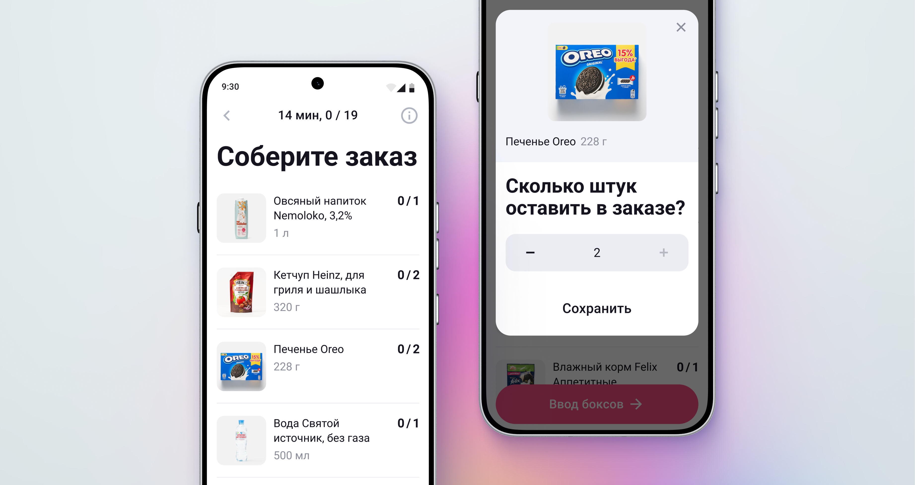
An app that made store operations faster and helped the business scale
Samokat delivery and store operations app
Read case study
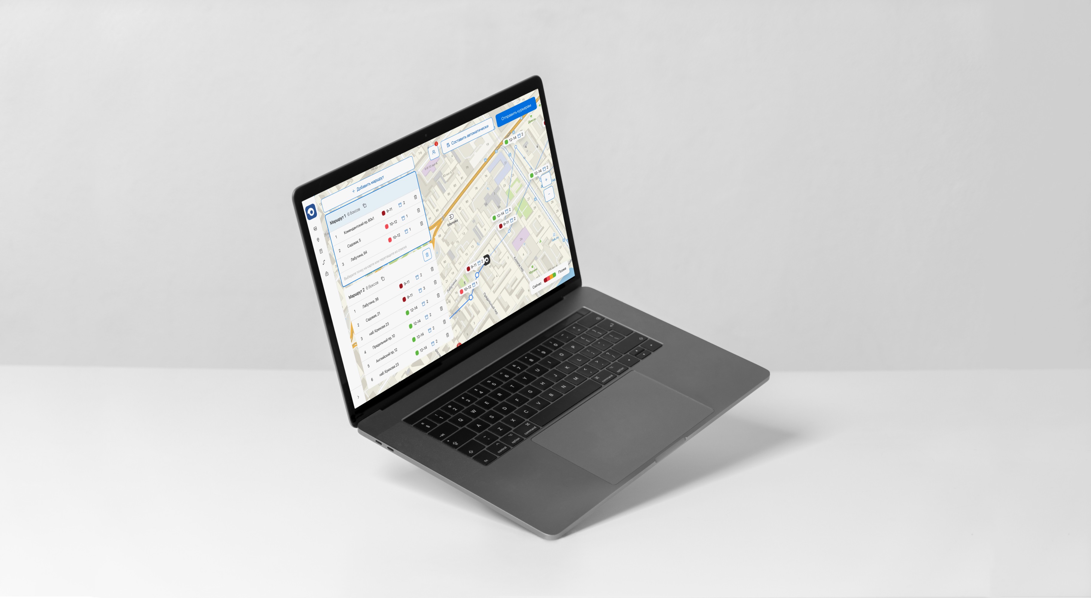
A web route-planning interface that cut planning time by 40x
Route planning web tool for Samokat
Read case study
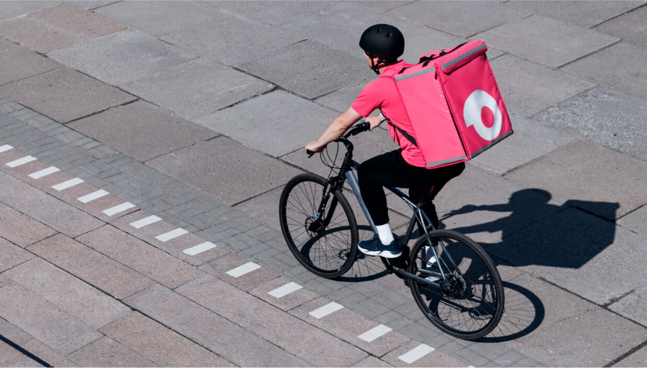
Bonus: A new form factor for delivery bags that tripled order capacity
Delivery bags for Samokat couriers
Read case study
A React Native migration that expanded the hiring funnel by 32%
Period
December 2022 — June 2023
Company
Samokat, instant grocery delivery
Users
Store staff and partners
Role
Product Design Lead
Summary
I made the app available on iOS by redesigning it with the new React Native mobile design system, expanding the hiring funnel by about 32%. As one of the first products built on the system, it also helped validate real use cases, refine components and patterns, and prepare the design system for scaling across other products. This groundwork later contributed to broader efficiency gains, reducing development effort by 20%.
32%
increase in the hiring funnel for store staff
20%
reduction in development effort
Context
The app for operational tasks was initially available only on Android, which considerably limited the hiring funnel. As the business expanded and iOS support became a priority, we decided to replace the legacy app with a new React Native version built on the new design system, making it available on both platforms while reducing long-term maintenance costs.
Goal
Adapt the full functionality of the existing app for warehouse operations and delivery to iOS devices using the new React Native design system.
Process
I split the migration into several stages:
- Auditing all existing functionality covering multiple dark-store roles
- Identifying improvement opportunities stemming from accumulated design debt
- Breaking the project into smaller tasks and planning design work within resource constraints
- Designing screens, running reviews with BAs and designers, then with engineering
- Usability testing with target users
We started with delivery flow: (1) couriers are the largest user group, (2) they use personal phones (often iPhones), and (3) delivery flows are simpler and faster to ship than other operations.
New Style & Palette
Historically, the mobile design system had a different visual style from our app. We chose not to retheme the design system to the familiar coral, to avoid complicating token management and to test the hypothesis that the pink accent color provides additional value for couriers beyond mere habit.
We couldn’t ship dark mode in the first version because the app’s palette is controlled by design-system tokens—and the design system team had this effort deprioritized. This was the perfect chance to refresh our understanding of dark mode demand across roles (spoiler: yes—couriers need it more).
Visual style update
Simplifying Navigation
We regularly collect user feedback and add to the UX debt backlog. Many small UX issues had lingered for years because legacy code made them expensive to address. A redesign was a great chance to fix these without changing core flows or product logic.
Text buttons
Minimal icon-only buttons were ambiguous in places, increasing learnability time and feature discoverability issues. I replaced unclear icon buttons with text buttons.
Clear text buttons replaced ambiguous icons
Minor actions in bottom sheets
To preserve context during secondary actions within a main flow, I replaced some full-screen modals with bottom sheets—simplifying the flow and reducing cognitive load.
Bottom sheets replaced full-screen modals
Reordering within routes
When we first shipped the route-editing feature, we weren’t sure couriers would reorder stops mid-delivery. Field studies showed misordered routes were common—due to algorithmic or user error—and even at handoff a courier might realize the address was wrong.
The ability to change stop order was hard-wired as a workaround: a user could tap “Back” several times, return to the start screen with the full route, and only then reorder. So in the new app we implemented this properly in a user-friendly way—now the route can be edited at any step of the delivery by tapping the “Info” icon.
User-friendly route reordering
Improving usability
Selecting orders
Order cards had low affordance: newcomers didn’t realize tapping would select a card instead of opening the order screen. In the new app, unselected cards show empty checkboxes, making it clear that the cards are selectable.
Showing checkboxes on order cards
Viewing comments
Customer comments are displayed on the order card because they can contain critical information about the delivery address. Before we separated things on the side of our customer-facing app, comments could also include any buyer requests, including notes for the picker (e.g., product expiration dates, etc.).
Before the redesign, the comment expanded right inside the card, which made the content height jump and shifted the scroll position—creating inconvenience for the user. I moved the full comment text into a bottom sheet over the main screen to keep the layout simpler and reduce the use of custom components.
Viewing full comment text in a bottom sheet
Team review
The migration to React Native and development of the cross-platform app were handled by a new engineering team. My role was to bring them up to speed on the app’s functionality from scratch, highlight important UX and UI nuances, and—after handing off the designs—answer all questions that arose as the work progressed.
Team review of mockups and flows
There were many questions: we discussed details of the new screens and corner cases that hadn’t been accounted for in the design. The team also proposed a number of valuable ideas for design improvements, some of which concerned the design system. Following these discussions, I compiled a list of minor refinements and moved on to a second iteration, after which I proceeded to user testing.
User testing
I prepared the usability test with our UX researcher—she validated questions and tasks, selected sample users, and handled recruiting. She also suggested remote testing to reduce effort and broaden the sample.
We posted the test link on our internal platform where couriers see company announcements. 1,562 respondents participated; 1,211 completed the final step.
Clicks on non-target elements
Results:
- All 6 tasks showed high success metrics with a median of 97.1% (share of respondents who completed the target flow).
- 2 of 6 tasks had many clicks on non-target elements—suggesting target elements lacked clear signifiers or weren’t prominent enough.
- Free-form feedback yielded strong insights that informed further research and refinements.
Refinements based on test results
Based on the test, I made critical design fixes—boosting size/contrast of interactive elements and improving the readability of features that had caused confusion.
Refinements in later versions
The new app launched about a year later, at the end of 2023. After the release, we actively gathered feedback through UMUX surveys, field studies, app store reviews, and identified issues:
- Without dark mode, evening deliveries were uncomfortable for couriers.
- Design-system text sizes were too small for on-the-go use.
- Couriers missed the coral theme, which they associated with Samokat’s “pink” brand.
We added these to the backlog alongside technical bugs and fixed them over the following year.
Outcome
After launching the cross-platform version, the app became available to 47k potential users (+32% vs. before), widening the hiring funnel and reducing Android device procurement costs by roughly 57 million rubles.
For users, the new app increased accessibility: dark-store staff could work from their personal iPhones instead of buying a work phone. From a UX standpoint, we improved usability by clearing two years of design debt and simplifying navigation.
Thanks to React Native and the shared design system, designing and building new features now takes 20–25% less time.
Explore more projects
An app that made store operations faster and helped the business scale
Samokat delivery and store operations app
Read case study
A web route-planning interface that cut planning time by 40x
Route planning web tool for Samokat
Read case study
Bonus: A new form factor for delivery bags that tripled order capacity
Delivery bags for Samokat couriers
Read case study
A React Native migration that expanded the hiring funnel by 32%
Period
December 2022 — June 2023
Company
Samokat, instant grocery delivery
Users
Store staff and partners
Role
Product Design Lead
Summary
I made the app available on iOS by redesigning it with the new React Native mobile design system, expanding the hiring funnel by about 32%. As one of the first products built on the system, it also helped validate real use cases, refine components and patterns, and prepare the design system for scaling across other products. This groundwork later contributed to broader efficiency gains, reducing development effort by 20%.
32%
increase in the hiring funnel for store staff
20%
reduction in development effort
Context
The app for operational tasks was initially available only on Android, which considerably limited the hiring funnel. As the business expanded and iOS support became a priority, we decided to replace the legacy app with a new React Native version built on the new design system, making it available on both platforms while reducing long-term maintenance costs.
Goal
Adapt the full functionality of the existing app for warehouse operations and delivery to iOS devices using the new React Native design system.
Process
I split the migration into several stages:
- Auditing all existing functionality covering multiple dark-store roles
- Identifying improvement opportunities stemming from accumulated design debt
- Breaking the project into smaller tasks and planning design work within resource constraints
- Designing screens, running reviews with BAs and designers, then with engineering
- Usability testing with target users
We started with delivery flow: (1) couriers are the largest user group, (2) they use personal phones (often iPhones), and (3) delivery flows are simpler and faster to ship than other operations.
New Style & Palette
Historically, the mobile design system had a different visual style from our app. We chose not to retheme the design system to the familiar coral, to avoid complicating token management and to test the hypothesis that the pink accent color provides additional value for couriers beyond mere habit.
We couldn’t ship dark mode in the first version because the app’s palette is controlled by design-system tokens—and the design system team had this effort deprioritized. This was the perfect chance to refresh our understanding of dark mode demand across roles (spoiler: yes—couriers need it more).
Visual style update
Simplifying Navigation
We regularly collect user feedback and add to the UX debt backlog. Many small UX issues had lingered for years because legacy code made them expensive to address. A redesign was a great chance to fix these without changing core flows or product logic.
Text buttons
Minimal icon-only buttons were ambiguous in places, increasing learnability time and feature discoverability issues. I replaced unclear icon buttons with text buttons.
Clear text buttons replaced ambiguous icons
Minor actions in bottom sheets
To preserve context during secondary actions within a main flow, I replaced some full-screen modals with bottom sheets—simplifying the flow and reducing cognitive load.
Bottom sheets replaced full-screen modals
Reordering within routes
When we first shipped the route-editing feature, we weren’t sure couriers would reorder stops mid-delivery. Field studies showed misordered routes were common—due to algorithmic or user error—and even at handoff a courier might realize the address was wrong.
The ability to change stop order was hard-wired as a workaround: a user could tap “Back” several times, return to the start screen with the full route, and only then reorder. So in the new app we implemented this properly in a user-friendly way—now the route can be edited at any step of the delivery by tapping the “Info” icon.
User-friendly route reordering
Improving usability
Selecting orders
Order cards had low affordance: newcomers didn’t realize tapping would select a card instead of opening the order screen. In the new app, unselected cards show empty checkboxes, making it clear that the cards are selectable.
Showing checkboxes on order cards
Viewing comments
Customer comments are displayed on the order card because they can contain critical information about the delivery address. Before we separated things on the side of our customer-facing app, comments could also include any buyer requests, including notes for the picker (e.g., product expiration dates, etc.).
Before the redesign, the comment expanded right inside the card, which made the content height jump and shifted the scroll position—creating inconvenience for the user. I moved the full comment text into a bottom sheet over the main screen to keep the layout simpler and reduce the use of custom components.
Viewing full comment text in a bottom sheet
Team review
The migration to React Native and development of the cross-platform app were handled by a new engineering team. My role was to bring them up to speed on the app’s functionality from scratch, highlight important UX and UI nuances, and—after handing off the designs—answer all questions that arose as the work progressed.
Team review of mockups and flows
There were many questions: we discussed details of the new screens and corner cases that hadn’t been accounted for in the design. The team also proposed a number of valuable ideas for design improvements, some of which concerned the design system. Following these discussions, I compiled a list of minor refinements and moved on to a second iteration, after which I proceeded to user testing.
User testing
I prepared the usability test with our UX researcher—she validated questions and tasks, selected sample users, and handled recruiting. She also suggested remote testing to reduce effort and broaden the sample.
We posted the test link on our internal platform where couriers see company announcements. 1,562 respondents participated; 1,211 completed the final step.
Clicks on non-target elements
Results:
- All 6 tasks showed high success metrics with a median of 97.1% (share of respondents who completed the target flow).
- 2 of 6 tasks had many clicks on non-target elements—suggesting target elements lacked clear signifiers or weren’t prominent enough.
- Free-form feedback yielded strong insights that informed further research and refinements.
Refinements based on test results
Based on the test, I made critical design fixes—boosting size/contrast of interactive elements and improving the readability of features that had caused confusion.
Refinements in later versions
The new app launched about a year later, at the end of 2023. After the release, we actively gathered feedback through UMUX surveys, field studies, app store reviews, and identified issues:
- Without dark mode, evening deliveries were uncomfortable for couriers.
- Design-system text sizes were too small for on-the-go use.
- Couriers missed the coral theme, which they associated with Samokat’s “pink” brand.
We added these to the backlog alongside technical bugs and fixed them over the following year.
Outcome
After launching the cross-platform version, the app became available to 47k potential users (+32% vs. before), widening the hiring funnel and reducing Android device procurement costs by roughly 57 million rubles.
For users, the new app increased accessibility: dark-store staff could work from their personal iPhones instead of buying a work phone. From a UX standpoint, we improved usability by clearing two years of design debt and simplifying navigation.
Thanks to React Native and the shared design system, designing and building new features now takes 20–25% less time.
Explore more projects
An app that made store operations faster and helped the business scale
Samokat delivery and store operations app
Read case study
A web route-planning interface that cut planning time by 40x
Route planning web tool for Samokat
Read case study
Bonus: A new form factor for delivery bags that tripled order capacity
Delivery bags for Samokat couriers
Read case study